
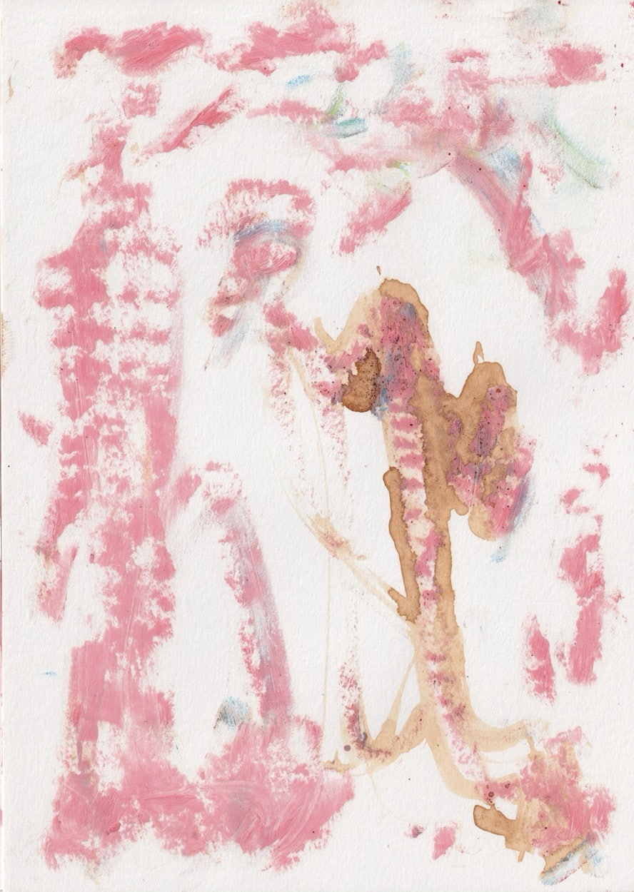
“There’s No Golden Rule for When Something Is a Letter”

A letter isn’t a fixed form but an agreement, something we settled on at some point. Take that seriously and type design becomes the freest of all disciplines: a kind of drawing that comes, on one hand, from pure feeling and, on the other, always aims at communication. Achim Reichert has spent more than two decades in exactly that in-between space, from Offenbach to his own Paris studio to a professorship in Saint-Denis. His typefaces don’t come from catalogues or models but from a kind of compulsion, “the world is a certain way, and for that I need this particular vibration”, and almost always out of dialogue: with artists, with projects, with the requirements that are meant to surprise him. For the Spring / Summer issue of Numéro Berlin, he designed the cover typefaces of every cover, something new and refreshing.
Achim Reichert: I’m curious about what someone does with the typefaces. The wonderful thing about type design is that you’re essentially making a drawing, you’re allowed to draw. And I say “allowed” deliberately, because afterwards it also serves a purpose. For me it was always like this: I enjoy drawing, but I didn’t want to bother anyone with the idea that this is some great drawing, there are a thousand great draughtsmen. So making type was a lovely thing, because I could draw and it had a purpose at the same time, something for communication. First for my own work, but when you hand it to someone else, they can keep working with that drawing language. And what comes out of it I never expected. When I see what someone does with it, I might think: oh God, I’d never have done it that way. But, hello, that’s exactly the point.
AR: Well, that’s also something people are shown by example. And it surely comes from the digital side too, that you have permanent access. On a shoot the client can look over your shoulder constantly; the moment it’s in the camera, they have access. Or via PDFs. That kind of permanent control is possible today. The nice part would actually be the time in between, between the making and the print, the maturation, that free time. It gets cut away. And that’s precisely where it happens, where something comes into being.
The question of the different disciplines is interesting too. On one hand everyone wants to break out of their discipline. On the other it shows a certain disrespect towards the actual craft. Graphic design is always the first to shout: okay, do whatever you want with me, you’re the client, you’re paying. It’s vulnerable from the start. With magazines there’s the added factor that they get their money from clients. We once made a magazine because we found the content interesting, because we wanted to know how people work creatively. But when it came to monetising it, it ran through buy-ins, a brand buying its way into the thing. And many magazines say of their own accord: we’re here to carry your vision. So it’s partly self-inflicted, because you’re looking for a business model. But those are just my observations; I’m no expert.
AR: Exactly; together with my partner. We were essentially doing graphic design for the art world.
AR: I would say, art wasn’t anything special here back then; there was no strong art scene. There were people doing things, of course, who have since become more successful. The magazines that shaped that period were Purple and Self Service, which helped a lot. It was definitely a time when you didn’t yet know exactly what was happening. Some people were already doing great things in the late nineties. I didn’t pick up on a lot of it because I was limited by the language, too. So you saw a lot of it wide-eyed and had no idea how established it already was, or wasn’t.
Today it’s much more professional, of course. Every gallery knows the procedures. It’s become a machine, and I don’t mean that negatively, it’s become a functioning thing. As for the underground: in Frankfurt or Offenbach there was always an environment where you made your own exhibition spaces, put your own things out. In Paris I always found that a bit lacking, that little gets made here on one’s own initiative, although of course things like Self Service or Purple also came out of that kind of underground.
AR: But what I have to say is: the magazines that came later were already squinting pretty quickly at how they could be useful to the client. They were far more service providers. They’d say: hello, we’re the young line and we’ll bring you to the youth. But that got stronger. That, though, really is just my personal perception.
On the other hand, there’s a huge amount going on right now. Among the generation of thirty- to forty-year-olds, and the younger ones, the twenty-year-olds, there are constant new magazine launches, people doing things, simply enthusiastic about the craft. Whether that yields a genuinely new kind of photography, I can’t say. Twenty years ago it was a bit more everyday, a bit more romanticising daily life, there were always styles, too. So I can’t say all that much about the change; maybe I’m not the right chronicler for it.
I find it fascinating how it has developed here. Because people don’t stay in their posts forever, new people are constantly being appointed. In the fashion houses too, new designers keep coming in, often from their own circle of friends. Something is always developing. I have the impression that there are possibilities to do something.
AR: If you’d complain to a fashion designer fifteen years ago that Helvetica is always the one being used, they wouldn’t have known what Helvetica is. Things like that happened, with people who are genuinely intelligent, but for whom typography simply wasn’t important. And that’s fine; I don’t know cutting techniques either. But that there hadn’t yet been much collaboration, that the limits weren’t being tested, what can you do with type, what with communication? I found that a shame. I always saw more potential there. That’s also why we made a magazine back then, because we wanted to connect fashion, type and creation.
So I think it’s good that the fashion world is now more willing to experiment with type. And that there are now typefaces in play that may have originated twenty years ago, out of a very simple will to bring a particular form into the world. Because that’s really what it is: you create a formal language and you want it to live. That’s the great thing about it: if you make a drawing on paper, you have to hang it in a gallery, or these days you do it on Insta. But a typeface, you make it as a file, hand it to someone, and then it lives, then it gets printed.
And with all these branding things in particular: for a while everything went sans serif, now people are starting to bring in more traditional typefaces again. There’s this back-and-forth about what branding is, what identity is, how neutral it has to be.
What even is neutral? These questions aren’t conclusively answered; there are always new answers to them.
AR: Out of feeling, yes, whatever form interests me at the moment. It can also be a form that’s simply rectangular. Then I ask myself: what can I do with this? And then it collides with the requirements a typeface has. The B is composed differently from an A, but in the same formal language. And then I notice: my idea of the form doesn’t fit the T at all. So I work on it and let myself be surprised by the requirements.
That’s one side. Alongside that there are things where I think: I’m interested in this technique: If I write very small, for instance, what’s it like when I make it big? What comes out of that? Those are experimental series, nothing extraordinary: you set yourself a constraint and see what happens. What tends not to happen with me: that I see an old book or an old type catalogue and think, oh, I’ll make the new version of that. Others can do that.
AR: I don’t think it differs much. Four or five years ago when I left the studio i had as a duo I was at the point of asking myself: what do I actually want? I can’t just keep doing exactly the same thing I’d pursued for twenty years. I was sitting at my desk, luckily had a sheet of paper and a pencil, and I just started drawing. And I realised: this is exactly what I want. The only question was: how can this work so that I make money from it? That’s basically been my fundamental task for five or six years.
And at some point it started to feel like back when I was drawing letters for typefaces. I’m not thinking about letters at all, but maybe they’re in there anyway. There’s this back-and-forth: is it a drawing, is it a letter? A letter is something we’ve agreed on, something we recognise. A form isn’t a letter because it has a particular shape, but because at some point we agreed that that’s the shape for that letter. I have to keep reminding myself of that: there’s no golden rule for when something is a letter and when it isn’t. No good Lord decided it. That also gives me a freedom, really, you can use anything as a letter. Because I now have this continuous drawing practice, the process has become even clearer. I can look at it even more neutrally.
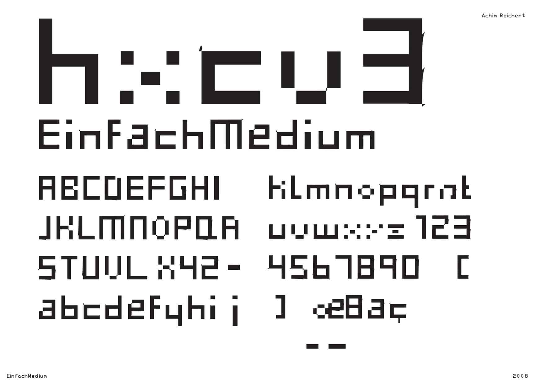
AR: This is not my first, but it’s the typeface I was really excited over. It came about when I started making type. That was the techno era, you took existing typefaces, altered them, broke them, attacked them. But I constantly had the feeling I was holding old things in my hands, tinkering with stuff from the fifties. And then I thought: I have to make this myself. Out of myself, from zero, from scratch.
At the same time there was the pronouncement from the typography professor in Offenbach: I can’t teach you this, there’s no course for it, so it can’t be done. But there were people in my circle who did it anyway and said: just do it. And then I sat in the computer room one night and simply drew all 255 characters with the mouse. Suddenly it was there. For me that was a breakthrough, for others it’s nothing special, but for the first time I could say: hey, this is a typeface, it’s digital now, and I can work with it.
AR: Exactly. Then I thought: I’ll clean it up a bit, because the basis is great, it looks harmonious, not just scrawly or handmade. By the way, those filled areas in the second style appear automatically, when you set point after point, the program always generates a surface. Two points make a line, a third makes a triangle.
That was the foundation for everything. From it I made a script style, a linear serif style. A very simple working-through on the basis of this thing, also to break open how type used to be cut. We had new media, after all; you could approach it more casually and see what happened. There were then things inspired by logos, where you work with curves, or the variant with the extremely broad band nib. The whole thing really just shows a bit of the process, and the thought that it doesn’t have to be a certain way.
Then there was the hymn-book typeface, drawn with a very fine nib, as an intermediate step towards Helvetica. And I realised: this is great, because it’s neither just a children’s typeface nor pretentious. What bothered me for a long time, you see, is this vertical order: there’s a sender and a receiver, and the receiver has to be convinced by the beauty that the sender is better than they are. That gradient. There’s nothing wrong with that, you’re allowed to dream upwards. But you can also try to communicate horizontally, at eye level, and still with quality. That you don’t take the thing so seriously. That’s why it suited me well to use these typefaces for projects.
AR: This series here is roughly the first four years. At some point that was enough. Maybe for some project you had to adjust something, add a few letters, change a weight. It’s called Try, for the attempt. That was the attempt.
After that it was more individual things, often solved through projects. For a musician (Cornelius Cardew), for instance, a poster series, he did a lot of community work, hence a very illustrative type. Or a painter (Nicolas Chardon) who works only with squares and surfaces, he got the complete opposite, a really scratchy typeface, not like Suprematism, not like Malevich. So there were typefaces that wanted something, and typefaces that came about in response to something.
A friend of mine, Wolfgang Breuer, noticed there’s no program that lets you say digitally: here’s a circle, here’s a line, and I want to change the size of this circle. There’s no function for that. So he had a program written and gave it to me, and out of that I made a typeface. He had this geometric, digital idea, and the question was: what do you do with it, how can you develop it further? Or here, it must have been right at the beginning here in Paris, through the graffiti and the Arabic script that was very present here at the time, a different kind of wrist movement came into it.
Then there was a project for documenta. The artistic directors didn’t want to make a documenta where great art is shown and everything else is just okay; they wanted to question every area: what is a magazine, what is a wayfinding system, what is a poster? They posed that question first, and there was an independent answer for each discipline. That’s also nice with regard to our theme from the beginning: that you give each discipline its space rather than subordinating it.
AR: Sure, harder to control, but then often great things come out of it. I think the viewer always senses whether something was made out of a kind of self-importance or because you think you have to do it that way. With that wayfinding system the idea was: we want people to be accompanied, not led by the hand from above. There are only suggestions, there’s the documenta halle, there’s the spot. For that I developed a typeface that runs at chest height, like a graffiti thing, just written down like that. That’s the kind of thing that comes out.
There are also typefaces that arose purely from a formal idea, that I wanted to combine thick surfaces with very thin ones, simply to see what comes out. A thought like plant stems, purely from feeling. You get typefaces that are almost uncontrollable, that go beyond themselves, but also ones that work for body text and are still interesting at large sizes, in display, because they have nice details.
AR: That was about the question of how many points you need. For a book about a French philosopher I once wanted to make a different roman style. Or here, those are things where you constrain yourself geometrically in order to generate a feeling.
Another was a commission from the artist Tania Bruguera. She wanted a typeface that’s legible everywhere in the world, so, 40,000 characters. I didn’t know it either, but I asked myself: what makes a typeface illegible to other people, what makes it foreign? And I thought: a typeface becomes foreign to me when it contains components of another culture, strokes and forms we never use. I took that foreignness and said: I’ll make a typeface that has no such form at all. That’s what came out.
AR: Absolutely. For me everything is constantly a dialogue anyway. And it’s a stroke of luck that there are people, like Tania, who say: I don’t need an image or a newspaper, I need a typeface for my project. Because I got stuck in the art world, working a lot with artists, I was able to do quite a bit.
But a lot also came from me. I once ran a typography workshop with illiterate people, for instance, because I wanted to know what typography actually is. Quite naively thought: I’ll just ask illiterate people, since they can’t read. And I learned that they tick in a completely different way. Out of that I made a typeface that shows a bit of it, the way someone I got to know writes very simply. I was later able to use it again for a catalogue at the Museum of Modern Art, for an architect. It fit. It’s nice when you can keep developing something like that.
AR: There were always workshops. But now, for the first time, I have a longer professorship, at the Université Paris VIII in Saint-Denis Vincennes. She was founded around 1968, those thinkers like Deleuze or Foucault worked there. De Gaulle wanted to push the ’68 movement out of Paris and set them up out there in the forest. Also to give them space. You’re welcome to check that, but that’s my understanding. It’s not a Sorbonne, a different mindset, much more horizontal. But also not an art school, it’s something else, a bit bigger, a bit tougher too.
I’m co-responsible for creation there. I see my task as getting people to make something. I don’t teach type design or graphic design from A to Z; instead I develop assignments and see what happens, in the hope that as much as possible comes out of it.
WEEKEND MUSIC TIP PT 102 LAVENDER
He has quietly worked his way up through Germany’s underground rap scene, but recently…
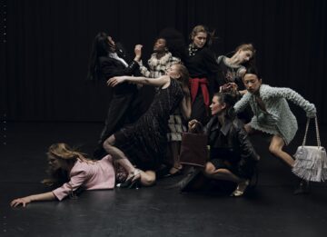
Poetic Narratives: Franka Marlene Foth on Dance, Creation and Authorship
For Franka Marlene Foth, dance was never a decision – it was a condition. In…
WEEKEND MUSIC PT 101 BASHKKA
BASHKKA on WHOLE Festival, Queer Joy and the Power of the Dancefloor
IN CONVERSATION WITH BRUNO CASANOVAS FROM NUDE PROJECT
A business fairytale straight from the books: Bruno Casanovas and Alejandro Benlloch met…
WEEKEND MUSIC TIP PT 99 – M¥SS KETA
M¥SS KETA under Nonni surveillance - …
IN CONVERSATION WITH EIVIND LANDSVIK
What do you do when the one thing you’ve sacrificed everything for stops working?…